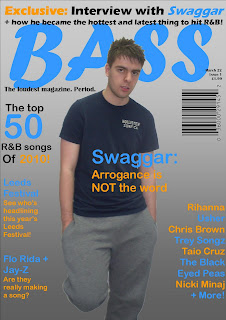
This is the process in which I created my final front cover.
This is how I started to create the front cover. I had already known that I was going to use the colours blue and orange, but I didn't know which shades I was going to use, as I knew that there was going to be a problem with the background, being that some of the text would be fairly hard to read. I had also already known that I wanted to use a grey colour for my background, but again I didn't know which shades of this colour I wanted to use.
By this stage, I had started to put the colour scheme on different sections of the magazine cover, such as the names of the artists on the right hand side. I had also changed the colour of the masthead. This is because I thought that it stood out to the more masculine audience, which is what I was intending to do. I had also changed the colour of the 50 on the left hand side. This is because it was fairly hard to read, and now a house style is beginning to emerge.
On this stage of the process, I had added the "Leeds Festival" cover line, and I changed the background slightly, to compensate for the colours, as I was beginning to realise that some of the text was hard to read. Now I can see that the frame of the front cover is starting to emerge, and I think that it looks professional.
This is the final front cover before I added the main image, and the barcode. When I was looking at the previous front cover, I noticed that there were a few changes to be made. One being the gap between the 50 and the R&B passage of text, so I minimized this. I also added the final cover line that goes on the left hand side, to make use of the space. All I need to do now is insert the image, and the barcode and then the cover will be complete.
This is the final front cover that I made. I am pleased with the outcome of this front cover, and I think that it looks like a realistic front cover, that would be used for a real magazine of this genre. The colours that I have used, blue and orange, are contrasting colours so they really stand out to the audience. With the background being grey, this also helps these colours to stand out. For the little bits of black that I have used, it stands out because of the lighter background colour, being a lighter grey than the bottom of the page. However, the cover line that says "Leeds Festival" is fairly hard to read. This is due to the blue colour not fully contrasting the background, so the audience may not be attracted to read this information as much as the other things on the front cover. This is also the same for "Usher" on the right hand side. The main image in the centre of the magazine cover I am also pleased with, as I believe that I have edited it quite well, leaving none of the background on the image. I think that I could have complimented the space more, meaning that I could have filled up more of the space, such as under the barcode, and to the left and the right of the legs of the person on the front cover.
After reading the audience feedback, and taking it all into account, I created this final front cover, as apposed to the previous one. I have changed the background to a lighter colour, which contrasts the colours more, which makes them easier to read, and don't hurt your eyes. This is more obvious on the "Leeds Festival" story line, and the "Usher" of the artist names. Thanks to the audience feedback, I was able to improve my final front cover, to make it better.


No comments:
Post a Comment