These are the music magazine articles that I had found for my research, and are the ones that I am going to analyse.
The thing that stands out the most on this double-page spread is the "Queen?" title, as it relates to the picture on the right. The fact that they have used a serif type font, it suggests that this magazine is quite exclusive. The blue of the question mark has came from the blue of her glasses, which is very effective, and is what most magazines do in their articles, or for any of their images. The main image is fairly unusual in the way that it is not in direct mode of address. Most magazines that feature images use a direct mode of address, making the person in the image look directly at the audience. In the middle of the text there is a quote, which again, is a fairly common characteristic in an article of a magazine.
This magazine article is unusual, in the way that the title is all different sizes. colour scheme is fairly dark, and doesn't have much colour in it at all, except the little bit under the title, which comes from the red of her top. She is in direct mode of address, which means that she is looking straight at the audience, which draws the audience in to buy the magazine, and read it. The writing is divided up in to four columns, which is also a common characteristic of a magazine. The writing goes over the centre of the page, which hides some of the writing, which could possibly make the audience misread the title. The font is also in a serif font, which suggests that the audience is fairly young compared to a magazine that uses a sans-serif type font.
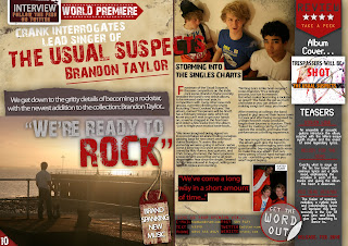
This magazine double-page spread seems quite busy, like there is too much going on, which I don't want to do on my magazine double-page spread. the colour scheme is also quite busy, there are a lot of colours in this article, which suggests that the target audience is for a younger audience than the other articles I am analysing. The images also suggest this, by having fairly young kids in the top right, shows that the audience is fairly young. Also, because they are using a sans-serif type font, it shows that this article isn't necessarily directed at an older audience, and that it isn't as exclusive as the previous magazine that had a serif type font.
This image, as soon as you look at it, suggests that it is also from an exclusive magazine. This is because of the "got the love", and the fact that the D of the opening sentence is bigger than the rest of the text, and is also in a serif type font. There isn't much of a colour scheme on this article, apart from the red and white that she is sitting on, which may have came from the redness of her hair. As soon as you look at it, you get the impression that it is quite exclusive, due to the fonts, colours and font sizes.


No comments:
Post a Comment